
In the Making Android Apps series, I share what I’m learning about what it takes to make an Android app. This article is about the major concepts of XML and UI on Android.
What is XML?
XML means eXtensible Markup Language. It’s pretty similar to HTML, but it hasn’t predefined tags and its common function is more about storing and transporting data than just displaying it.
A XML file contains elements, which are identified by tags. An element starts at an opening tag, which is represented by <> (i.e. <LinearLayout>), and ends at a closing tag, which starts with </ (i.e. </LinearLayout>). Also, it’s possible that an element has only 1 tag., which is called self-closing tag and starts with < and ends with /> (i.e. <TextView/>).
Now, let’s see how an interface is built.
TextView
 <TextView
	android:layout_width="150dp"
	android:layout_height="wrap_content"
	android:text="My Photos"
	android:textSize="22sp"
	android:textColor="#4689C8"
	android:textStyle="bold" />
This code produces the following output on the screen:

You can test it by yourself here.
Each one of these lines inside the tag is an attribute of the TextView. An attribute consists of a name and a value. For example,
this TextView has an attribute called android:text and its value is "My Photos". An value is assigned through an equal sign and
it’s always enclosed by double quotes.
Below, I’ll explain briefly about each attribute in the code snippet:
android:layout_width defines the width of the rectangle that holds the TextView’s content.
It’s measured by units of dp (density-independent pixel) and
has 2 special values: "wrap_content" and "match_parent".
"wrap_content"sets the view’s width equal to its content’s width."match_parent"sets the view’s width equal to its parent view’s width, if there is no parent view, then the screen’s width is used.
android:layout_height defines the height of the rectangle that holds the TextView’s content. It has the same value types as android:layout_width.
# TextView Attributes:
android:text sets the text that will be displayed on the screen. It’s constrained by the TextView’s dimensions.
android:textSize defines the size of the text. It’s measured in sp (scale-independent pixel) and should follow some guidelines. Also, it can have other special values as @string/my_photos.
android:textColor may be a color value, in the form of "#rgb", "#argb", "#rrggbb", or "#aarrggbb", and each digit is hexadecimal.
android:textStyle is the style for the text. It can be "normal" (default), "italic", "bold" or "bold|italic".
You can read more about TextView here.
ImageView
<ImageView
	android:layout_width="match_parent"
	android:layout_height="match_parent"
	android:scaleType="centerCrop"
	android:src="@drawable/beach" />
This code may scale an image and display it on the screen. I can’t say what image is displayed because it depends of what image is named beach.
So let’s talk about these new attributes.
# ImageView Attributes:
android:scaleType controls how the image should be resized or moved to match the size of this ImageView. The value
"centerCrop" scales the image while maintaining its aspect ratio so it’ll be equal or larger than its view. The image
is then centered in the view. Also, there’s the value "center", which center the image in the view without scaling it.
android:src sets a drawable as the content of this ImageView. A drawable is an image (.jpg, .png or .gif). The value
"@drawable/beach" says to get the image called beach on the folder /drawable.
This is the ImageView in my app Hogwarts Info:
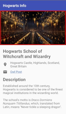
And this is the code:
<ImageView
	android:id="@+id/hogwarts_image"
	android:src="@drawable/dinner_hall"
	android:layout_width="match_parent"
	android:layout_height="0dp"
	android:scaleType="centerCrop"
	android:layout_weight="1"
	tools:ignore="ContentDescription"/>
As you can see, all the attributes I talked about before are there. However, there are a couple of new attributes. I’ll talk a bit about them.
# Other Attributes:
android:id creates an identifier for this view. Thus, it can be referenced elsewhere. This attribute is necessary
to work with RelativeLayout. The value "@+id/hogwarts_image" says to create the identifier "hogwarts_image" for this view.
android:layout_weight indicates how much of the extra space in the LinearLayout is allocated to the view associated with it. The space allocated is a proportion between the weight of this view and the sum of its weight and its siblings’ weight. For example, in this case, I set the height of this view equal 0 (read more about evenly spacing views), and the weight proportion is 1 by 2 for this view. So this view’s height should be equal to half of the extra space.
tools:ignore suppresses the given warnings/errors that could have been raised by Android Lint. In this ImageView, I set it to ignore the ContentDescription warning.
You can read more about ImageView here.
ButtonView
<Button
	android:id="@+id/next_button"
	android:layout_width="wrap_content"
	android:layout_height="wrap_content"
	android:text="@string/next" />
This code’s output is:

All of these attributes have already been discussed. The purpose of a Button is to allow the user to interact with the application, but those interactions are handled by the Java part of the app. I’ll talk about handling user input in the next article of this series. For now, you can read about the onClick attribute and the onClickListener method here and here.
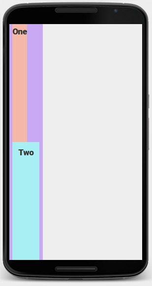
LinearLayout
<LinearLayout
	xmlns:android="http://schemas.android.com/apk/res/android"
	android:layout_width="wrap_content"
	android:layout_height="match_parent"
	android:background="#c9a8f4"
	android:paddingLeft="8dp"
	android:paddingRight="8dp"
	android:orientation="vertical">

	<TextView
		android:layout_width="wrap_content"
		android:layout_height="0dp"
		android:layout_weight="1"
		android:paddingTop="8dp"
		android:background="#f4b8a8"
		android:text="One"
		android:textSize="22sp"
		android:textStyle="bold"/>

	<TextView
		android:layout_width="wrap_content"
		android:layout_height="0dp"
		android:layout_weight="1"
		android:padding="16dp"
		android:background="#a8eff4"
		android:text="Two"
		android:textSize="22sp"
		android:textStyle="bold"/>

</LinearLayout>
If you paste this code on the Android Visualizer, you’ll see this:
# LinearLayout Attributes:
android:orientation specify whether child views are displayed in a row ("horizontal") or column ("vertical").
LinearLayout has other attributes like android:gravity and android:divider. See more here.
In addition, there are attributes that are obtained by the children of a LinearLayout.
They are android:layout_weight and android:layout_gravity.
Read more about them here.
# Other Attributes:
xmlns:android declares the android namespace. Namespaces provide a method to avoid element name conflicts.
Read more about XML Namespaces here.
android:background sets a color or a drawable as the view’s background.
android:padding sets the padding of all four edges. Padding is the space between the view’s edge and the view’s content.
Other variants are android:paddingTop, android:paddingBottom, android:paddingLeft and android:paddingRight, each one
for one side of the view.
Basically, any view can use these attributes. You probably noticed that there are some attributes that many views can use
like android:layout_width and android:layout_height.
They are inherited from the View class or the ViewGroup.LayoutParams class.
Finally, you can read more about LinearLayout here.
RelativeLayout
<RelativeLayout
	xmlns:android="http://schemas.android.com/apk/res/android"
	android:layout_width="match_parent"
	android:layout_height="match_parent"
	android:background="#c9a8f4"
	android:padding="8dp">

	<TextView
		android:layout_width="wrap_content"
		android:layout_height="wrap_content"
		android:padding="8dp"
		android:background="#f4b8a8"
		android:text="One"
		android:textSize="22sp"
		android:textStyle="bold"/>

	<TextView
		android:layout_width="wrap_content"
		android:layout_height="wrap_content"
		android:layout_toLeftOf="@id/three"
		android:layout_alignParentBottom="true"
		android:layout_marginRight="8dp"
		android:padding="8dp"
		android:background="#a8eff4"
		android:text="Two"
		android:textSize="22sp"
		android:textStyle="bold"/>

	<TextView
		android:id="@+id/three"
		android:layout_width="wrap_content"
		android:layout_height="wrap_content"
		android:layout_alignParentBottom="true"
		android:layout_alignParentRight="true"
		android:padding="8dp"
		android:background="#92efb1"
		android:text="Three"
		android:textSize="22sp"
		android:textStyle="bold"/>

	<TextView
		android:layout_width="wrap_content"
		android:layout_height="wrap_content"
		android:layout_marginLeft="36dp"
		android:padding="8dp"
		android:background="#eef280"
		android:text="Four"
		android:textSize="22sp"
		android:textStyle="bold"/>

</RelativeLayout>
This one is a little bit longer, but the output is pretty simple:
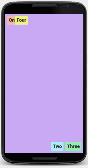
The most important part here are the RelativeLayout.LayoutParams, that is, the attributes obtained by the children of the RelativeLayout.
First, there are the attributes that position the child views relative to the parent. You can see some of them among the attributes of the
TextViews “Two” and “Three”, they are android:layout_alignParentBottom and android:layout_alignParentRight. Their values are just "true" or "false".
And there are the attributes that position the child views relative to each other. The TextView “Two” has the android:layout_toLeftOf.
Its value is the ID of the view used as reference.
If some child view doesn’t have a position relative to something, its position is set to default (top-left corner of the parent view). It’s the case of the TextView “One”. Also, the children of a RelativeLayout can overlap. The TextView “Four” is above the “One” because it’s defined later in the code.
# Other Attributes:
In this code, there’s a new attribute that any view can use. It’s the android:layout_margin attribute. It works similarly to
android:padding, but the extra space is added between the view’s edge and the edge of the next view. See more here.
Lastly, you can read more about RelativeLayout here.
Conclusion
And, basically, this is what I learned about XML in one week. Now you can make an app like mine! Of course, you’ll need to use an IDE like Android Studio or IntelliJ IDEA, what I didn’t cover because it isn’t the focus of this series.
The next article of this series will be about handling user input and making your app interactive. I hope you have liked it, feel free to leave any comments in the section below.